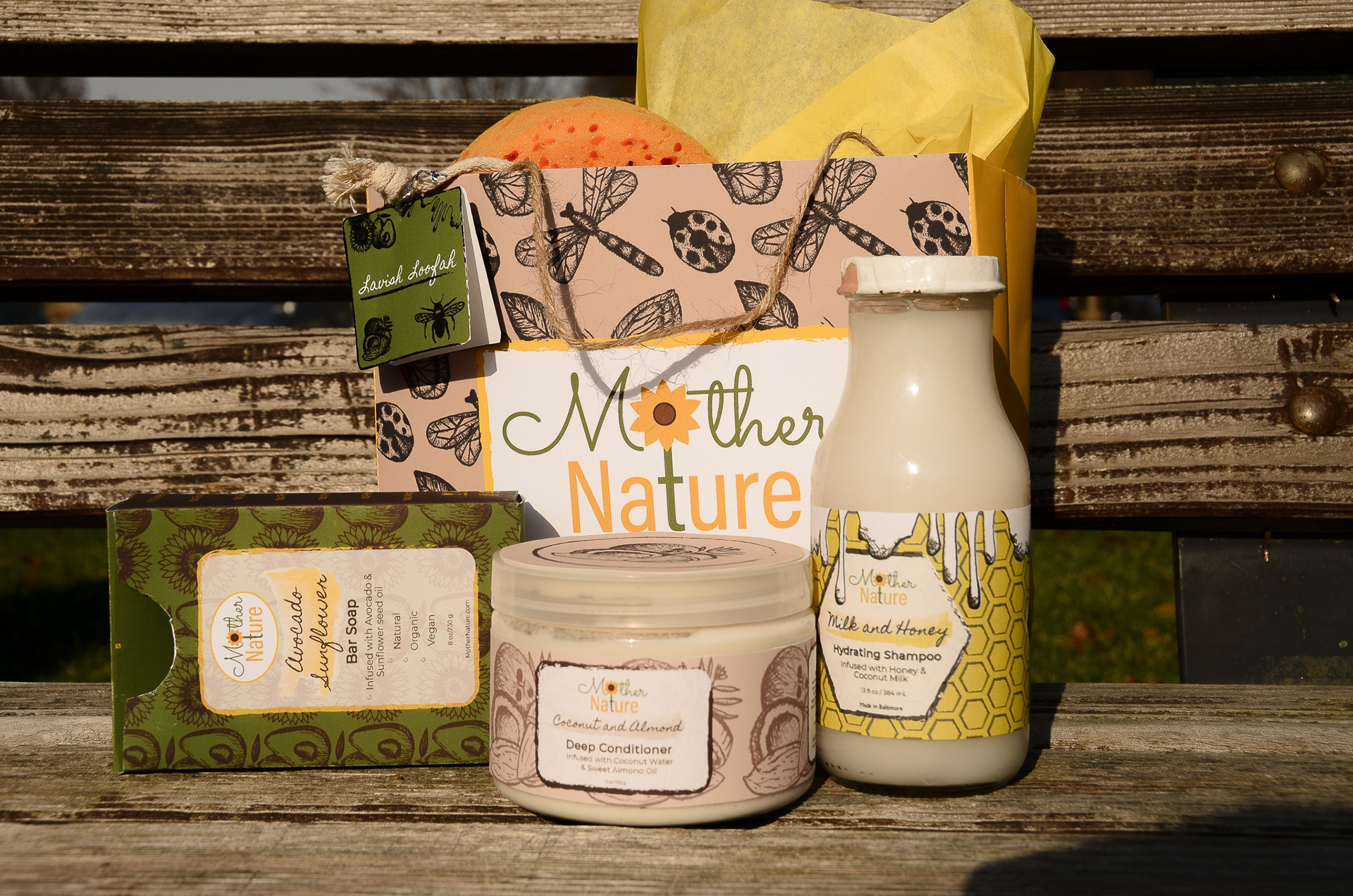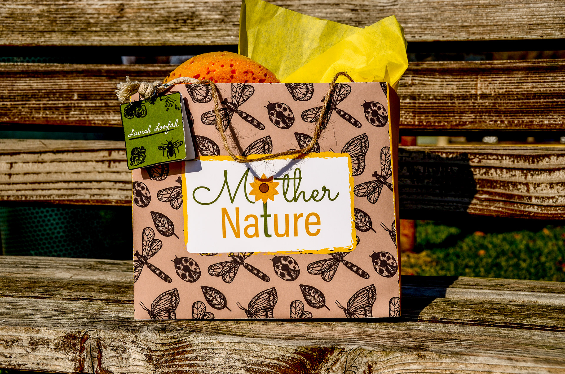


I'm excited to showcase my project for Mother Nature, a natural beauty brand that I had the pleasure of designing the logo, packaging, and branding for. I wanted to emphasize the brand's natural elements, so I used an earthy-toned color palette and created a logo where the "o" and "t" in "Mother Nature" connect to form a flower. To give the branding a handmade touch, I incorporated intricate hand-sketched elements, paired with a marker/handwritten font and borders that resemble watercolors. For this project, I had the pleasure of creating the branding, packaging, and photography for a natural beauty brand called "Mother Nature." I started by designing the logo, which features the "o" and "t" in "Mother Nature" connected to form a beautiful flower. To emphasize the natural aspect of the brand, I used intricate hand-sketched elements, paired with a marker/handwritten font and borders that resemble watercolors. For the packaging, I continued the handcrafted feel with pen-like sketched elements of nature, combined with an earthy color palette and a pen-like border. To complete the natural look and feel, I designed a rope-like handle for the bag, which adds a rustic touch and makes it easy to carry the product wherever you go. To further enhance the brand's natural feel, I did the photography myself. I chose textured, woodsy backgrounds and displayed the products on a park bench, showcasing the beauty of Mother Nature in a real-world setting. Overall, the project was a success, and I am proud to have created a cohesive and visually pleasing brand identity for Mother Nature.


